Wes Anderson Color Palette Explained (With Examples)

Table of Contents
- 1. Why Wes Anderson's color palette works
- 2. The Grand Budapest Hotel: cotton-candy pinks and purples
- 3. Asteroid City: sun-faded desert pastels
- 4. The Royal Tenenbaums: warm reds, yellows, and electric blue
- 5. Moonrise Kingdom: nostalgic yellows and scout green
- 6. Fantastic Mr. Fox: autumnal oranges and golds
- 7. Isle of Dogs: muted, earthy neutrals
- 8. The 60:30:10 rule behind every frame
- 9. How to recreate the Wes Anderson look in your edits
- Final thoughts
- Spotlight FX - Get free transitions, effects and workflow tools
You know a Wes Anderson frame the second you see it. The dead-center symmetry, the flat framing, and above all, those candy-colored pastels that make every shot look like a page from a children's book.
But here's what most people miss: Anderson's palettes aren't random. They're built on tight color rules, and once you understand them, you can recreate the look in your own videos.
In this post, I'll break down his exact color palettes film by film (with real hex codes), explain the color theory that makes them work, and show you how to pull off the look in your edits.
1. Why Wes Anderson's color palette works
Before the film-by-film breakdown, you need to understand one thing: Anderson uses color as story, not decoration.
In his films, one color usually dominates a scene, a second color supports it, and a small accent guides your eye. Nothing is accidental. Each film gets its own distinct palette, and he'll often shift palettes between scenes to signal a new chapter, mood, or time period.
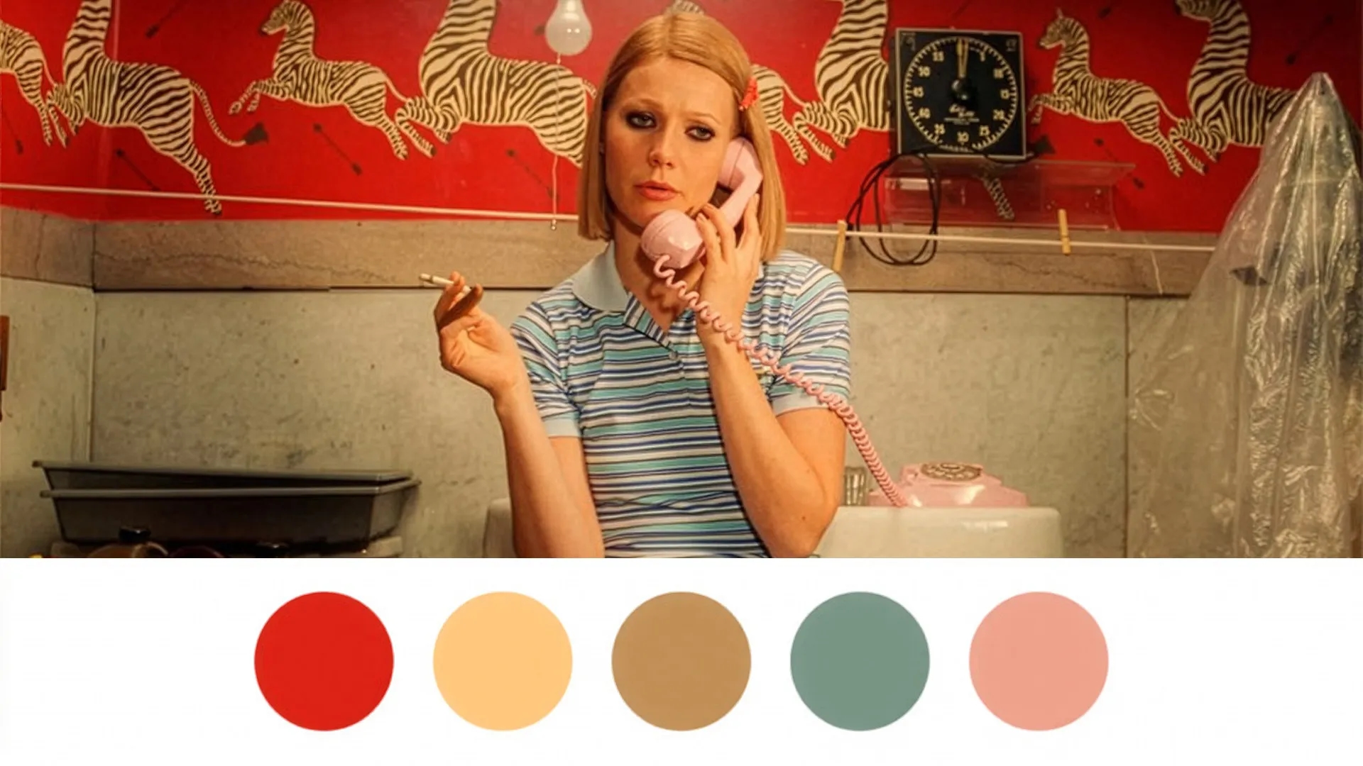
That's why his work feels so controlled. The pastels read as soft because the saturation is reined in everywhere except the spots he wants to pop. It's the restraint that makes the color hit.
Pro tip: When you study an Anderson frame, don't just look at the colors. Look at how few of them there are. A limited palette is doing most of the heavy lifting.
2. The Grand Budapest Hotel: cotton-candy pinks and purples
This is the palette most people picture when they think "Wes Anderson." The hotel's famous pink facade set the entire visual tone, and it's arguably his most recognizable color design.
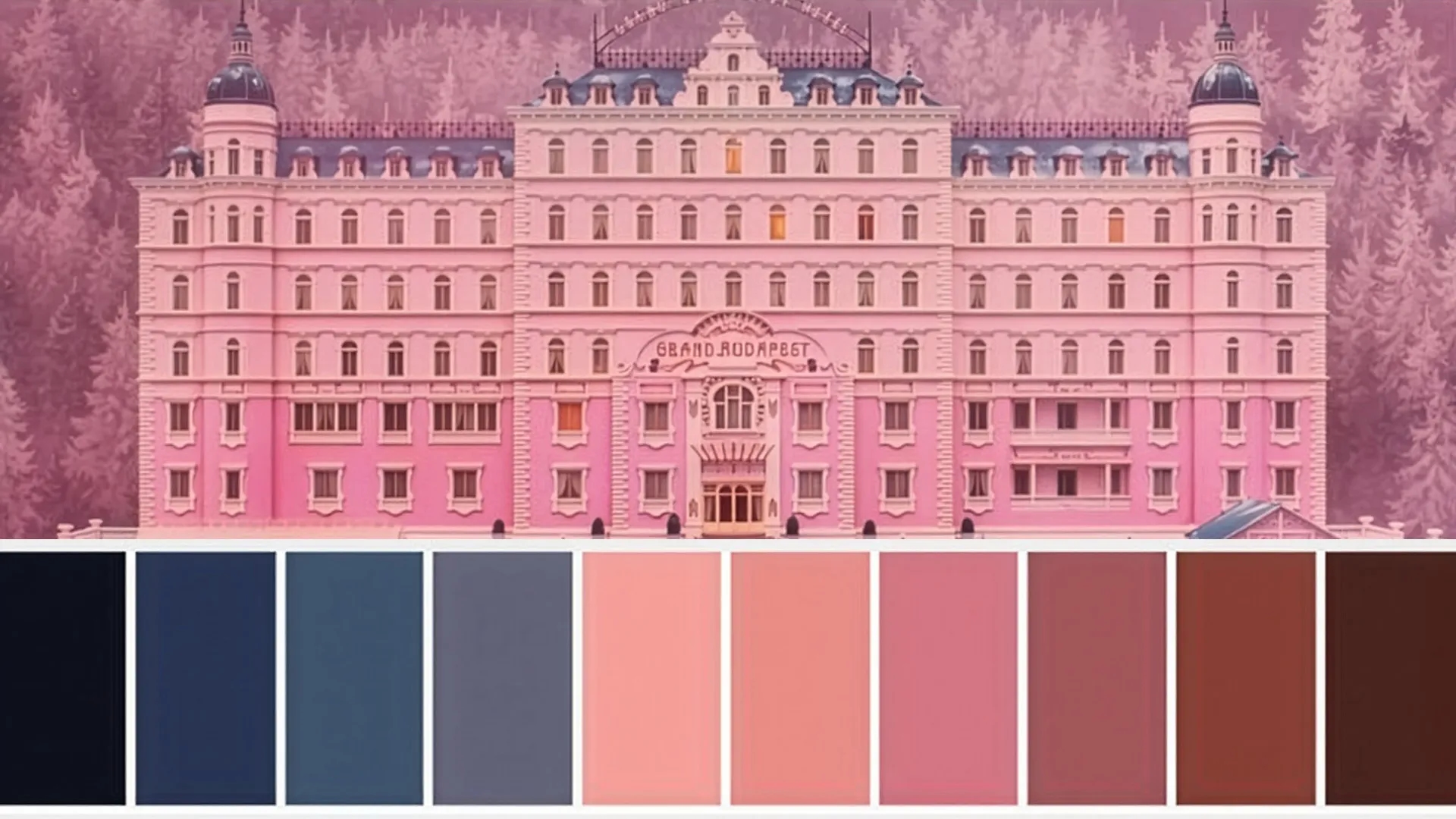
The palette:
- #FFBDD8 — cotton-candy pink
- #F4A8B9 — soft rose
- #A4D8FF — pale sky blue
- #F9D1BC — peachy neutral
- #8B5FBF — muted purple
What makes it work: The whole film is built around soft pinks, pale yellows, light blues, and deep purples, then punctuated with rich reds (like the Mendl's boxes and lobby boy uniforms). Those reds only pop because everything around them is muted and pastel.
It's a storybook, luxurious look that feels nostalgic and slightly unreal, exactly the fairy-tale tone the film is going for.
3. Asteroid City: sun-faded desert pastels
For his 2023 film, Anderson swapped the cool storybook tones for warm, dusty, mid-century Americana. Think 1950s desert town baked by the sun.
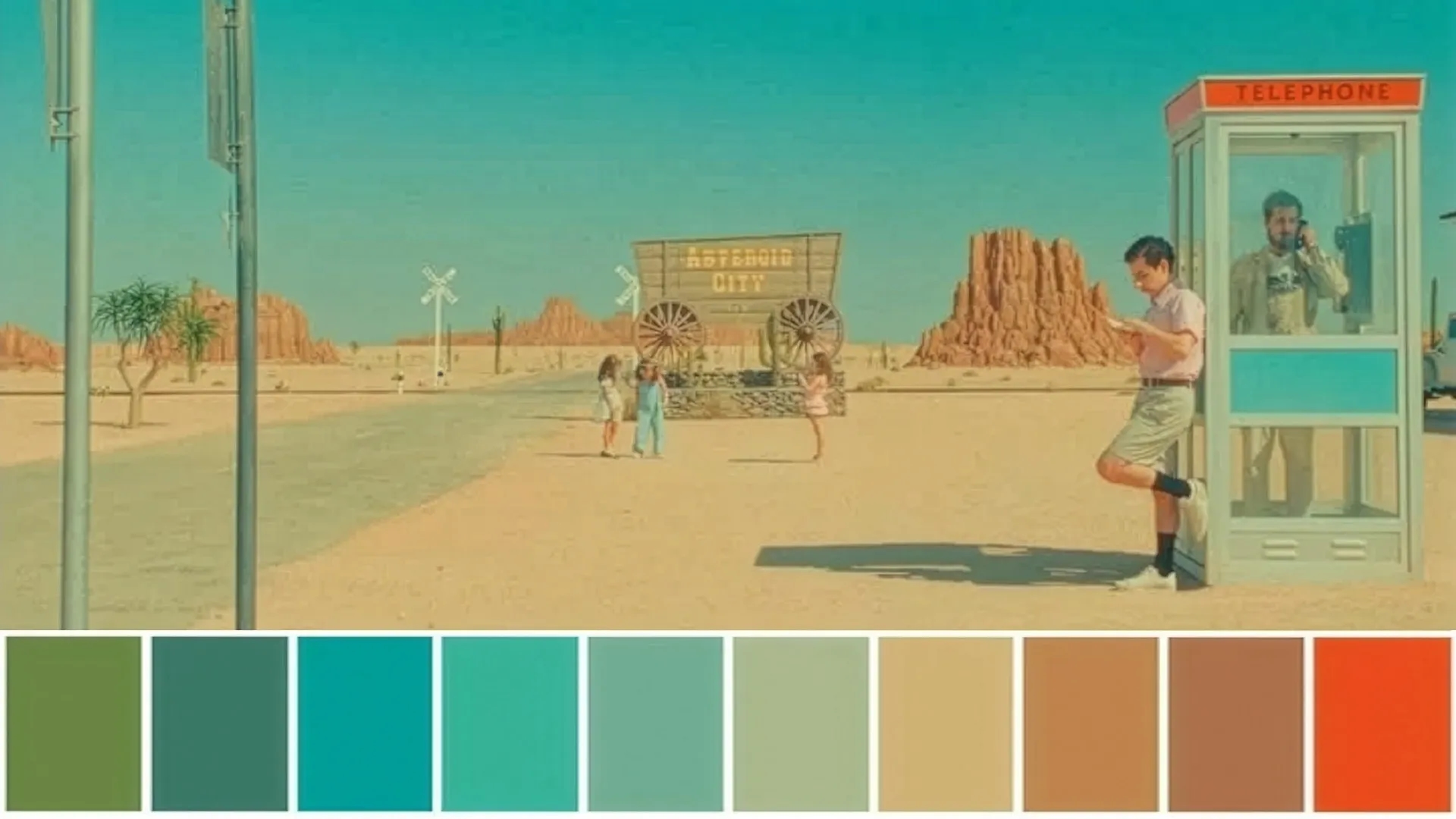
The palette:
- #F4D35E — mustard yellow
- #A7C5EB — dusty pastel blue
- #E6A8B5 — muted pink
- #DDD0C1 — earthy beige
- #8BAF9F — soft muted green
What makes it work: These are warm desert pastels with a deliberately "sun-faded" feel. The mustard yellow and beige ground everything in that retro Atomic Age look, while the dusty blue and muted pink keep it unmistakably Anderson. It's proof his style isn't just pink, it's the controlled, harmonized approach that carries across any color scheme.
4. The Royal Tenenbaums: warm reds, yellows, and electric blue
One of his earliest signature palettes, and one of his warmest. Critics often describe the film as "extremely warm," leaning into reds and golds to create that faded, autumnal family-home feeling.
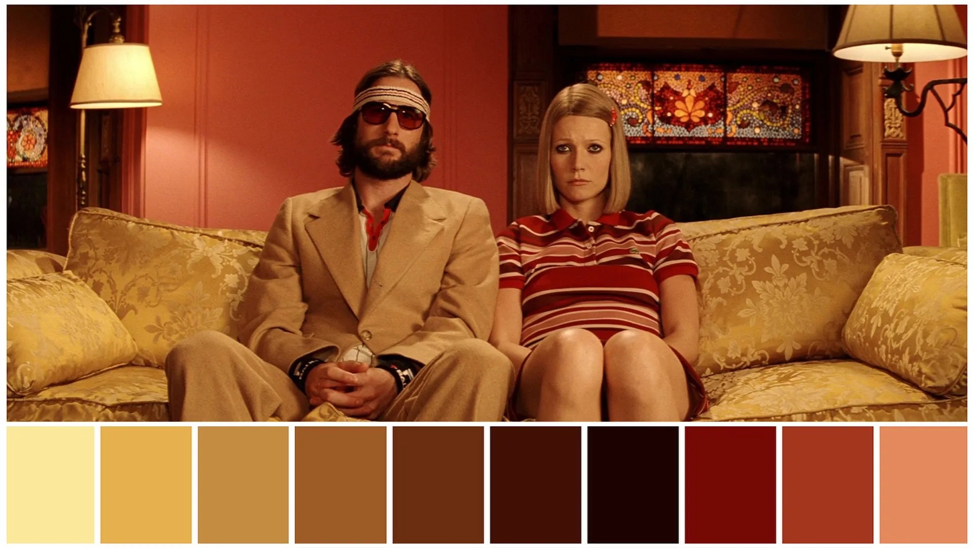
The palette character:
- Warm yellows and golds
- Reds and pinks
- Cream and beige neutrals
- Muted greens
- Electric blue (used as a cold contrast)
What makes it work: The film runs warm almost everywhere, with "a little extra red" baked into the grade. Then Anderson breaks it with electric blue in the colder, more emotionally distant scenes. That's color as story in action: the temperature of the frame mirrors the temperature of the moment.
5. Moonrise Kingdom: nostalgic yellows and scout green
This one's all about nostalgia. Set on a New England island in the 1960s, the palette feels like a faded summer-camp photograph.
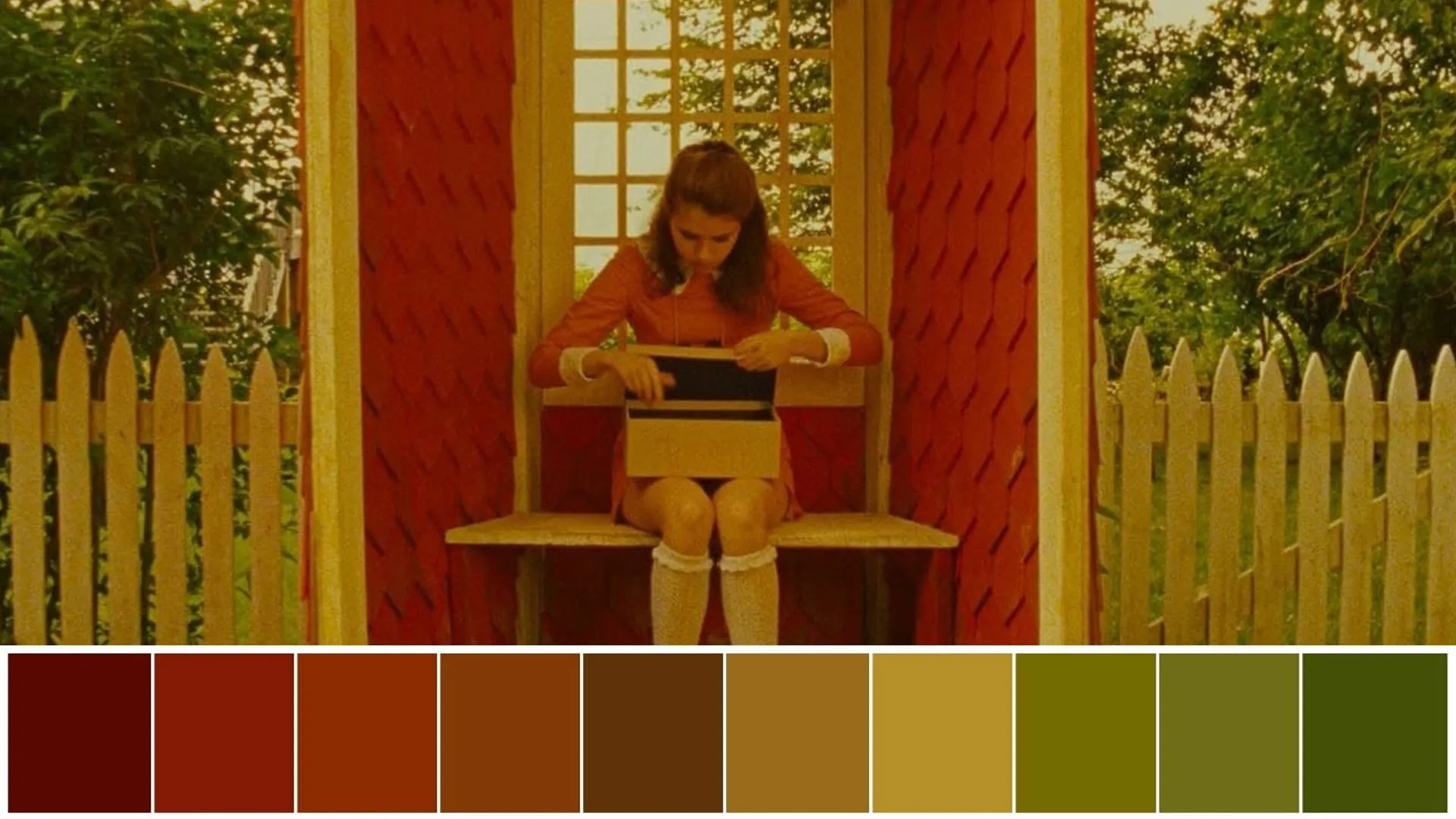
The palette character:
- Muted yellow (the dominant tone)
- Warm reds
- Boy-scout green (Khaki Scout uniforms)
- Soft creams and tans
What makes it work: Muted yellow does the heavy lifting, giving everything that warm, sun-bleached, memory-like quality. The scout green acts as the recurring accent that ties the kids' world together. It's a tighter, more earthy palette than Grand Budapest, but built on the same logic.
6. Fantastic Mr. Fox: autumnal oranges and golds
Anderson's stop-motion films get their own distinct palette language, and Fox is the warmest of the bunch.
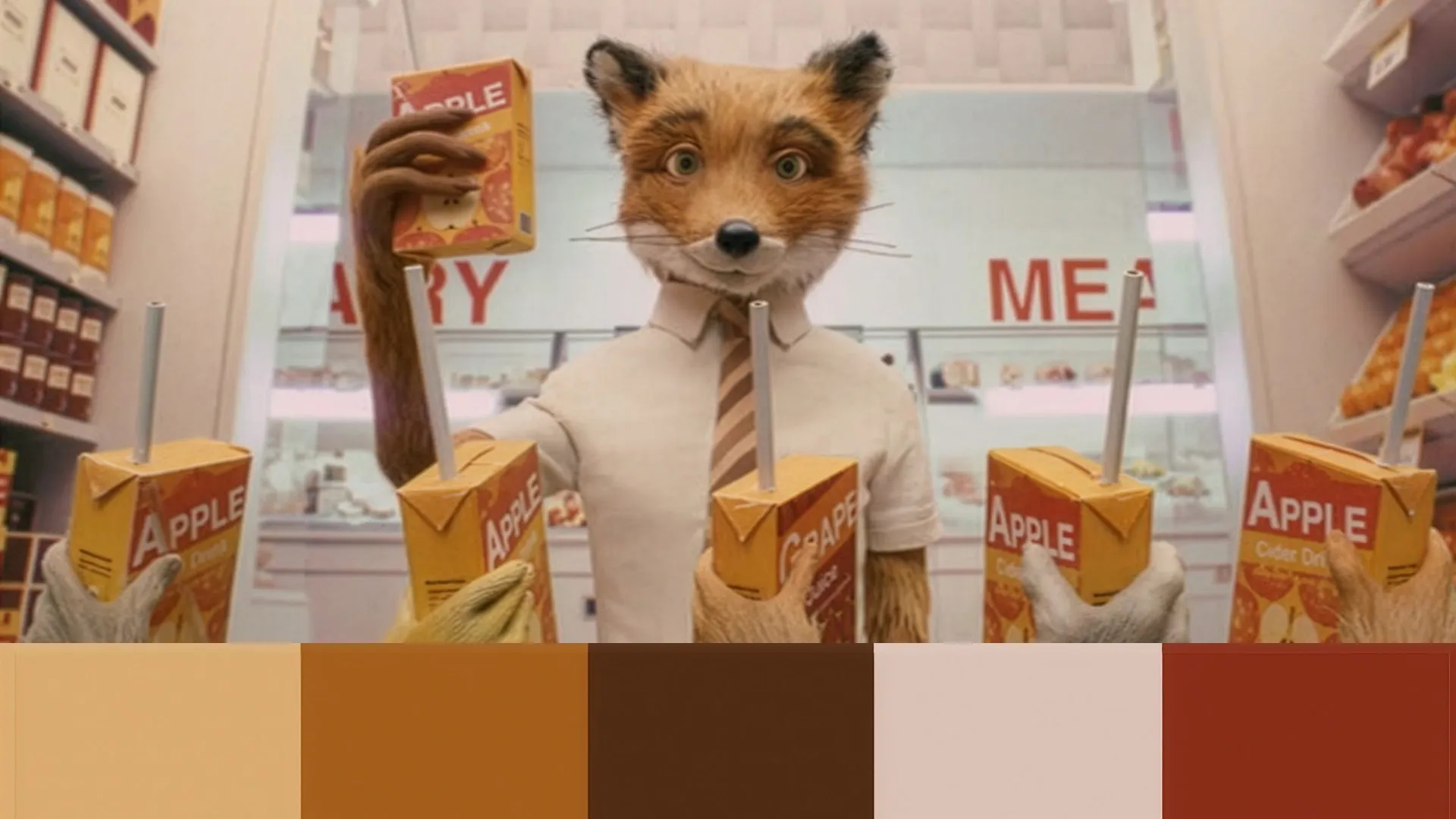
The palette character:
- Autumnal oranges
- Browns and rustic reds
- Golds and ambers
- Warm yellows
What makes it work: The handmade, tactile stop-motion look pairs perfectly with a rich autumnal palette. Oranges, golds, and browns make every frame feel like a crisp fall afternoon, and the warmth reinforces the cozy, storybook tone. It's a great example of how Anderson matches palette to texture, not just mood.
7. Isle of Dogs: muted, earthy neutrals
The outlier on this list. Where most of his palettes lean bright and pastel, Isle of Dogs goes desaturated and grimy to sell its dystopian trash-island setting.
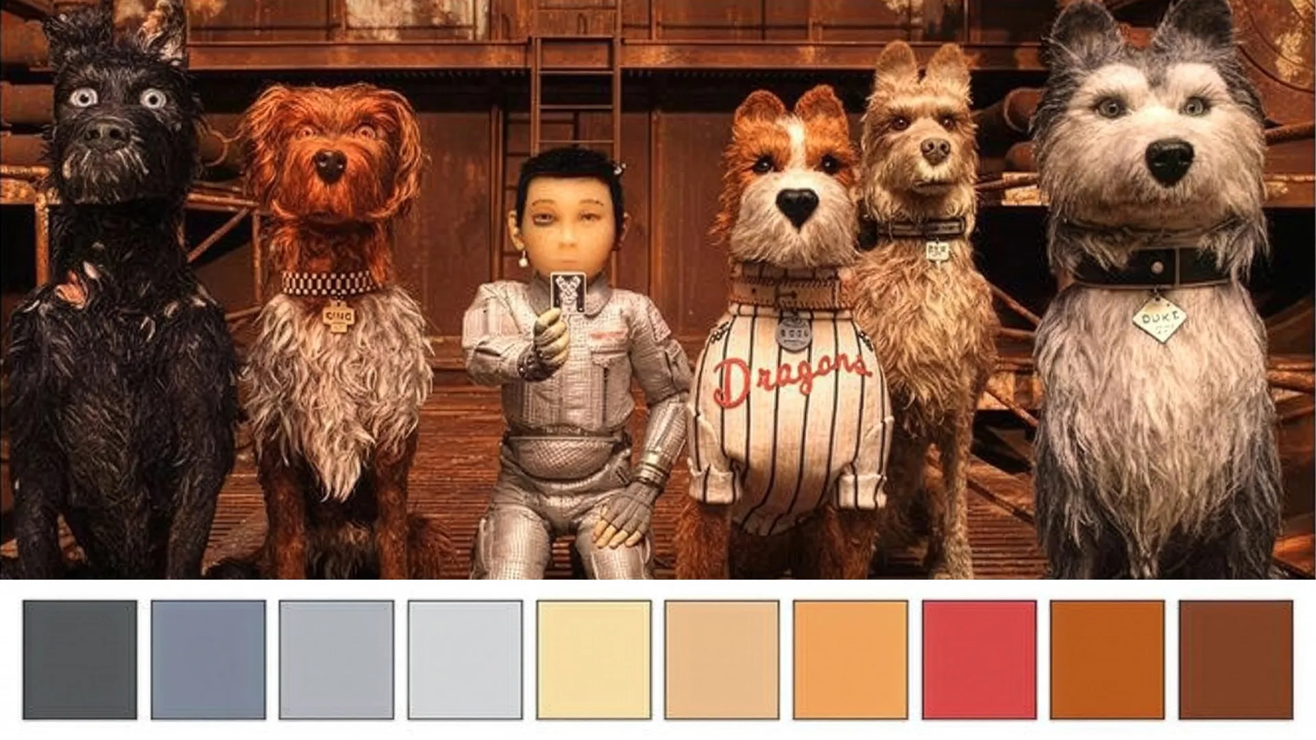
The palette character:
- Browns and dusty grays
- Blacks and charcoals
- Muted, earthy neutrals
- Occasional restrained pops of color
What makes it work: By stripping out the pastels, Anderson makes the rare bright moments land even harder. The neutral, desaturated base reinforces the bleak setting, then a single saturated color (a flag, a flower, a sign) cuts through and grabs your attention. Same color-as-story principle, opposite execution.
8. The 60:30:10 rule behind every frame
Here's a practical framework that explains why his frames feel so balanced: the 60:30:10 idea.
- 60% dominant color — the main tone that fills most of the frame (the pink hotel, the mustard desert).
- 30% secondary color — a supporting tone that harmonizes with the dominant one.
- 10% accent color — a small, often saturated pop that guides your eye to what matters.
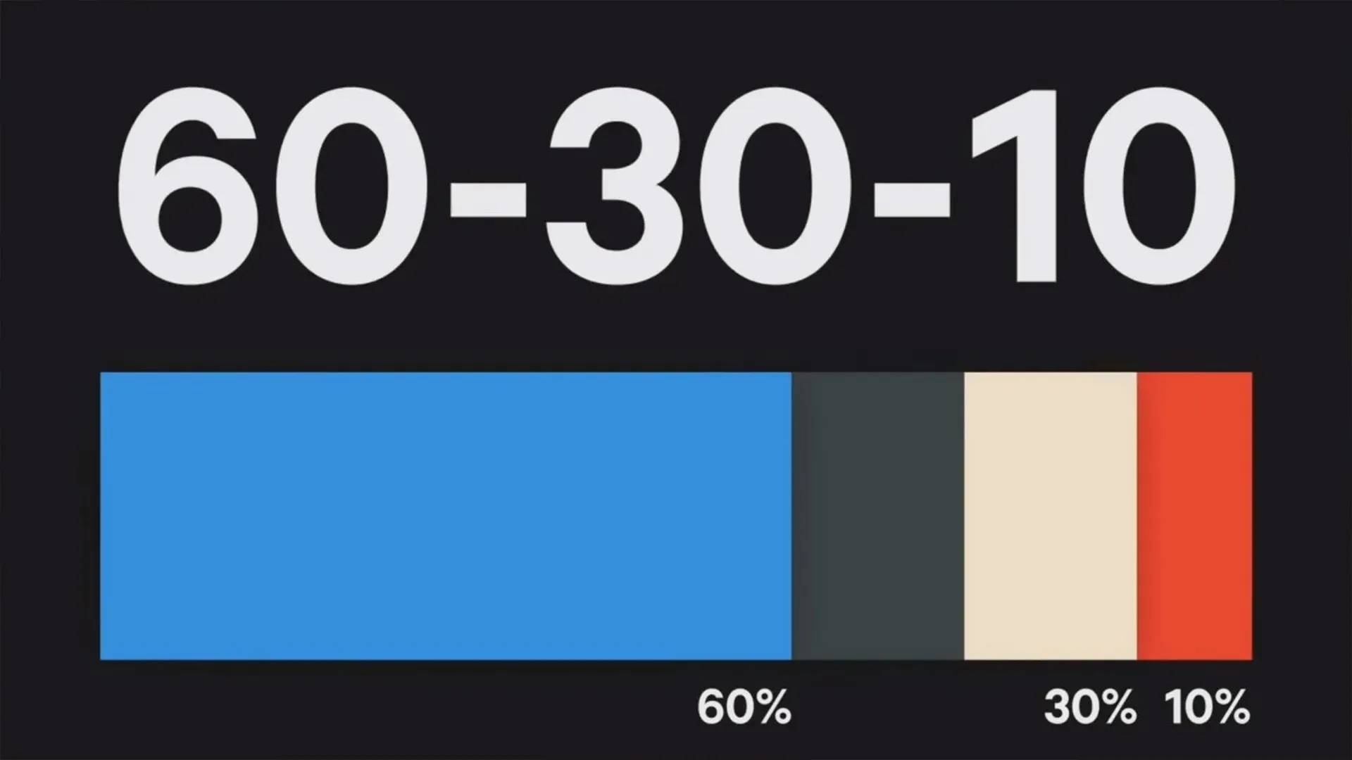
This isn't an official Anderson "doctrine," but it's a reliable production-design and editing framework for recreating that same controlled balance. Once you start seeing frames in 60:30:10, you can't unsee it.
Pro tip: When grading your own footage, decide your three colors before you touch the wheels. Picking your palette first stops you from over-saturating everything and losing the controlled look.
9. How to recreate the Wes Anderson look in your edits
You don't need a movie budget to get close. The look is mostly about restraint, consistency, and a few key grading moves. Here's the workflow:
- Nail symmetry and flat framing first. Center your subject, align doors, windows, and props to a vertical axis, and shoot frontal, perpendicular compositions. The color won't read as "Anderson" without the symmetry.
- Set white balance consistently. Make sure your tones don't drift from shot to shot. Consistency is what makes the palette feel designed.
- Pull saturation down slightly, then lift selectively. Reduce overall saturation, then bring back only the specific hues you want to read as pastel.
- Keep contrast soft. Don't crush your blacks or blow out highlights. Gentle contrast keeps that storybook softness.
- Use color separation. Keep wardrobe, set, and background distinct but harmonized so each element reads clearly.
- Match your shots tightly. Cuts should feel orderly and designed, not naturalistic.
If you're grading in Adobe, you can get most of this done with Lumetri in Premiere Pro or a few adjustment layers in After Effects, then save your look as a preset so it carries across every clip in your project.
Final thoughts
The biggest takeaway? Wes Anderson's palette isn't about pink. It's about control. Limited colors, soft saturation, tight consistency, and one accent that earns its spot. Get those four things right and you're 90% of the way there, regardless of which specific palette you borrow.
One last tip I didn't mention above: build yourself a reference board. Screenshot 5-6 frames from whichever Anderson film matches your project's mood, pull the hex codes (tools like Adobe Color make this quick), and grade toward those swatches. Working from a target is far faster than eyeballing it.
Related Posts

 Video Editing