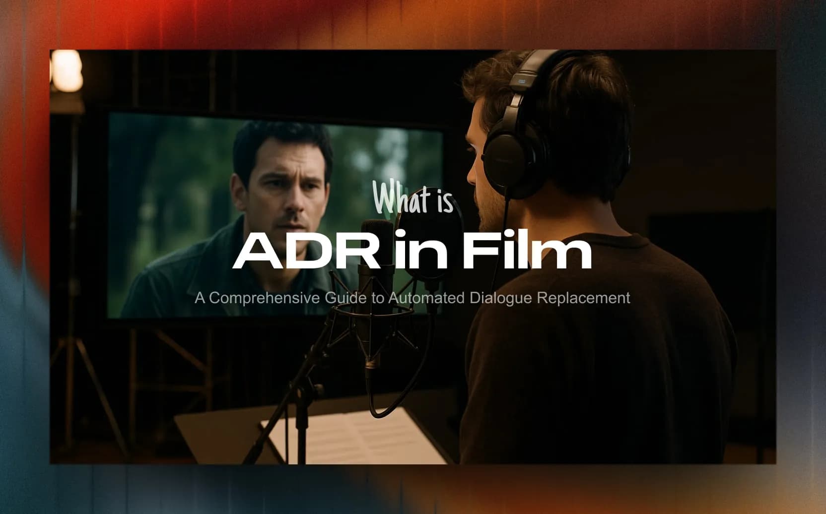
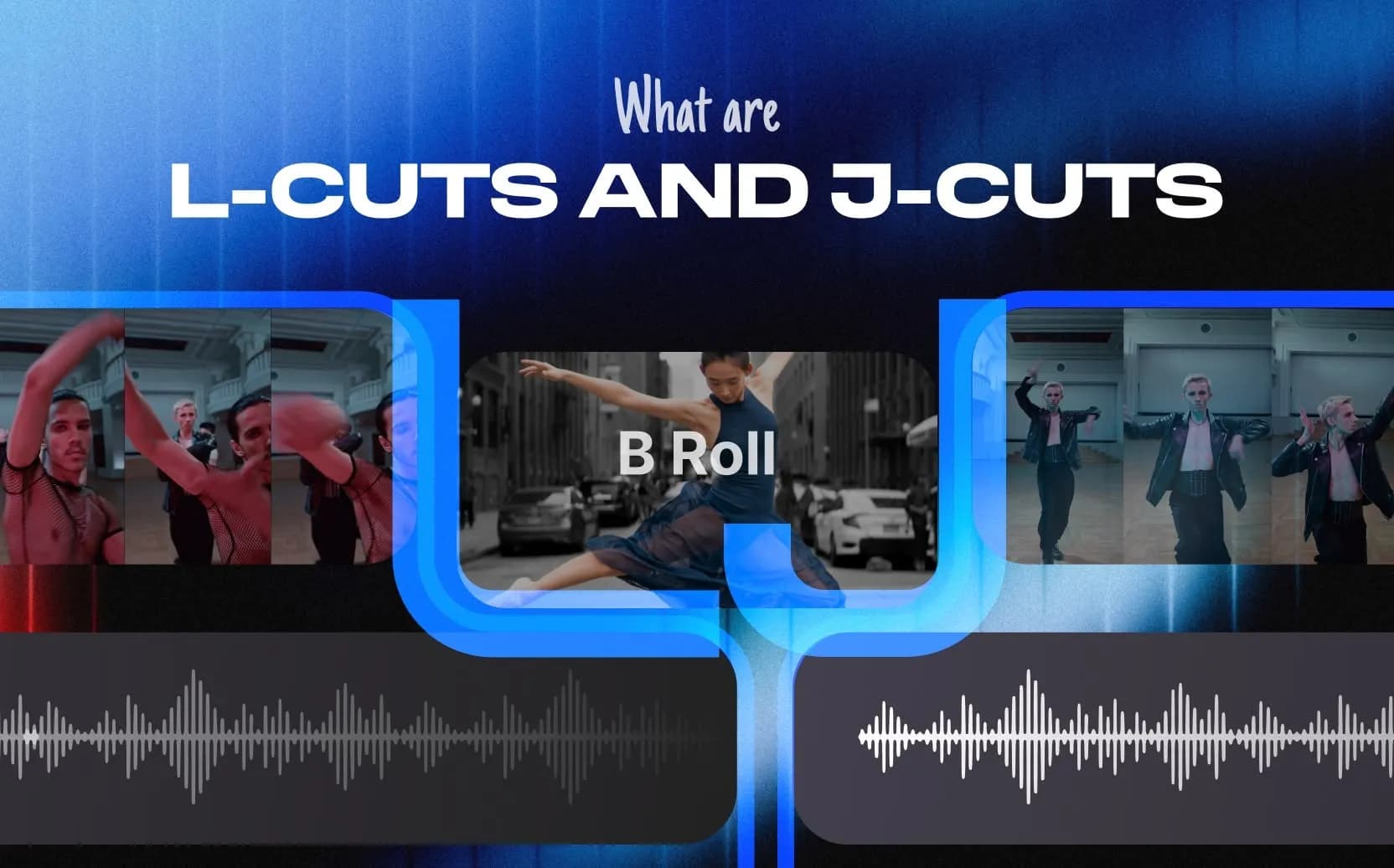
Vibrance vs Saturation in Color Grading: Key Differences
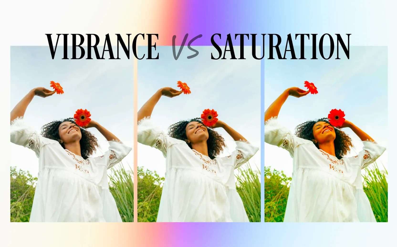
Table of Contents
- What is Saturation?
- What is Vibrance?
- How Do Saturation and Vibrance Adjust Color Differently?
- What Do Vibrance and Saturation Adjustments Look Like?
- When to Use Vibrance or Saturation
- How Do Editing Programs Handle These Tools?
- Potential Problems with Vibrance and Saturation
- Using Vibrance and Saturation Together
- Final Thoughts
- Spotlight FX - Get free transitions, effects and workflow tools
Adjusting how intense colors look is a basic part of editing photos and videos. Two main tools used for this are Saturation and Vibrance. They both change color intensity, but they work differently and create different results. Understanding this difference helps make images look better.
What is Saturation?
Saturation means how pure or strong a color is. Think of it like the amount of color pigment used. High saturation means a color is very vivid and bright, like a pure red or a deep blue. Low saturation means a color looks dull, muted, or grayish.
If saturation is reduced all the way to zero, all the color disappears, leaving only a black and white (or grayscale) picture.
Saturation is a technical term used in color science. It's part of how computers and software understand and describe color, often using systems like HSL (Hue, Saturation, Lightness) or HSV (Hue, Saturation, Value). In these systems, Saturation is one of the basic parts of a color, along with its actual shade (hue) and how bright or dark it is (lightness/value). Because it's a defined technical property, Saturation adjustments are generally straightforward math operations within the software. It changes the intensity of all colors in the image equally.
What is Vibrance?
Vibrance is often called a "smart saturation" tool. It's designed to adjust color intensity in a more subtle and targeted way than the basic Saturation tool. The main idea behind Vibrance is that it mostly affects colors that are already less saturated, making them more vivid. At the same time, it tries to leave colors that are already very bright and saturated alone, or adjusts them only slightly.
The Vibrance tool was made popular by Adobe in programs like Photoshop and Lightroom. It was created to solve common problems seen when using the standard Saturation tool, especially the tendency to make skin tones look unnatural and orange or to push already bright colors too far, causing detail loss.
Unlike Saturation, which is a fundamental property of color, Vibrance works using a special algorithm (a set of computer instructions). This algorithm looks at the image and tries to increase color intensity intelligently, aiming for a result that looks more natural to the human eye. A key part of this intelligence is protecting skin tones.
The fact that many different editing software programs now include a "Vibrance" tool or something similar shows that editors needed a way to boost colors without the harsh side effects of simple Saturation adjustments. While the name might be similar, the exact way these tools work can differ slightly between programs.
How Do Saturation and Vibrance Adjust Color Differently?
The core difference lies in how each tool applies the adjustment.
Saturation: The Uniform Approach
The standard Saturation tool changes the intensity of every single color in the image by the same relative amount. It doesn't check if a color is already very bright or very dull; it just applies the same level of increase or decrease to everything. If the saturation slider is increased by +20, it tries to make every color 20 points more intense.
This is often called a linear adjustment. It's predictable, but it can cause problems. For example, if an image has a deep red flower and a pale blue sky, increasing saturation will make both more intense. However, the red flower might quickly reach its maximum possible intensity and start losing detail (clipping), while the pale blue sky still looks okay. Saturation doesn't care; it pushes all colors equally hard.
Vibrance: The Selective Approach
Vibrance works differently. Its algorithm is designed to be selective. It looks for colors that have lower saturation levels to begin with and increases their intensity more strongly. For colors that are already close to being fully saturated, it applies much less of an increase, or sometimes no increase at all.
This helps bring duller parts of an image to life without making the already colorful parts look overdone.
- Skin Tone Protection: A major feature of Vibrance is its ability to recognize and protect skin tones. Skin usually has colors in the orange, yellow, and red range. The Vibrance algorithm is programmed to apply very little saturation increase to these specific color ranges. This prevents people from looking overly orange, red, or artificial, which often happens when using the standard Saturation tool on portraits. How it does this is complex, likely involving identifying specific hue and saturation combinations typical of skin and applying a gentler effect there.
- Cooler vs. Warmer Tones: Some believe Vibrance tends to boost cooler colors (like blues and greens) more than warmer colors (reds, oranges, yellows). Since skin tones are warm, this bias would naturally help protect them while allowing things like skies or grass to become more vivid.
- Non-Linear Operation: Vibrance uses a non-linear adjustment. This means the effect slows down as a color gets closer to its maximum saturation. Instead of pushing colors hard into the limit like Saturation does, Vibrance eases off, providing a 'soft landing'. This non-linear approach is key to why Vibrance looks more subtle and helps prevent color clipping. Clipping is when a color hits the maximum possible value, and all detail in that area is lost, appearing as a flat block of color. Vibrance's gentler, non-linear curve makes clipping much less likely.
In simple terms, Saturation is like turning up the volume on all instruments in an orchestra equally, while Vibrance is like selectively turning up the volume only on the quieter instruments, while barely touching the loud ones, and being extra careful with the singer's microphone (skin tones).
What Do Vibrance and Saturation Adjustments Look Like?
Because they work differently under the hood, applying Saturation versus Vibrance creates noticeably different visual results.
Overall Look
Using the Saturation slider often makes a big, overall change to the image. Since it hits every color equally, even a small adjustment can make the whole picture look dramatically different. It's easy to push Saturation too far, making the image look fake, "overcooked," or garish.
Vibrance usually creates a more subtle change. By focusing on the less colorful parts and protecting the already bright areas and skin tones, it tends to produce a more balanced and natural-looking result. It lifts the dull areas without making the intense colors feel overpowering. This often feels more "natural" because the Vibrance algorithm tries to avoid the harsh changes that our eyes find jarring. Simple saturation boosts can easily make an image feel wrong, even before technical problems like clipping occur. Vibrance's selective approach usually avoids this.
Handling Bright Colors
This is where the difference is very clear. Saturation pushes already bright, saturated colors even harder. This often leads to problems like:
- Color Clipping: The brightest colors hit their limit, and all the subtle details and textures within them disappear. Imagine a bright red rose petal turning into a flat, solid red shape with no visible texture.
- Posterization: Smooth color gradients (like in a sunset sky) break down into distinct, blocky bands of color instead of blending smoothly.
Vibrance is specifically designed to prevent these issues. Its algorithm sees the highly saturated areas and backs off, applying little or no extra saturation boost. This helps keep the detail and texture in vibrant colors and avoids the harsh transitions that cause clipping and posterization.
Skin Tones
This is often the most important difference in practice. Using the standard Saturation tool almost always makes skin tones look bad. Skin contains subtle mixes of reds, oranges, and yellows. A uniform saturation boost exaggerates these, making people look unnaturally orange, sunburnt, or reddish. This is usually very undesirable, especially in photos or videos of people.
Vibrance has a significant advantage here. It is specifically programmed to identify and protect these important skin tone ranges. This allows an editor to make other colors in the scene more vibrant (like clothing or backgrounds) while keeping the person's skin looking natural and healthy. For this reason, Vibrance is strongly preferred whenever people or even pets (which often have warm-toned fur) are a main part of the image.
When to Use Vibrance or Saturation
Choosing between Vibrance and Saturation isn't about one being universally better. It depends on the specific picture and what look is desired.
Use Vibrance When:
- Editing Portraits or Photos with People/Pets: This is the main reason Vibrance exists. Its skin tone protection is essential for natural results.
- Making Subtle Color Enhancements: If the goal is just a gentle lift in color intensity while keeping things looking realistic, Vibrance is usually the safer, less aggressive choice.
- The Image Has Mixed Saturation: If a photo has some colors that are already bright but others that look dull, Vibrance is great at balancing things out by boosting only the muted colors.
- Avoiding Problems: To minimize the risk of oversaturation, color clipping, or posterization artifacts, Vibrance is the safer option due to its protective nature.
- Protecting Existing Detail: If some colors are already very saturated, Vibrance helps prevent them from being pushed further and losing detail.
Use Saturation When:
- The Entire Image is Dull: If a photo looks completely washed out and lacks color everywhere, a careful, uniform boost with Saturation might be needed to bring it to life.
- Editing Non-Portrait Subjects: For things like landscapes, sunsets, flowers, or food photos where intense colors are often desired and there are no skin tones to worry about, Saturation can be effective. However, caution is still needed to avoid making skies too blue or plants too green unnaturally.
- Creating Stylized Looks: If the goal is a very strong, non-realistic effect (like pop art, or deliberately oversaturated, surreal colors), the Saturation tool can be pushed harder to achieve this.
- Reducing Color (Desaturation): The Saturation tool is used to decrease color intensity. Setting the slider to -100 removes all color, creating a black and white image. Vibrance cannot fully desaturate an image; some color usually remains.
- Initial RAW File Adjustments (Use Carefully): Sometimes, photographers apply a very small amount of Saturation to flat-looking RAW camera files to establish a baseline color level. However, many prefer using Vibrance even for this step.
Summary Table:
Scenario | Preferred Tool | Reason |
|---|---|---|
Portraits (People, Pets) | Vibrance | Protects skin tones from looking unnatural. |
Subtle, Natural Color Boost | Vibrance | Provides a gentler adjustment, looks less artificial. |
Image with Mixed Saturation Levels | Vibrance | Balances colors by boosting only muted areas. |
Avoiding Clipping/Posterization | Vibrance | Built-in protection minimizes risk of these problems. |
Globally Dull Image (Needs Lift) | Saturation | Affects all colors uniformly when a general boost is needed. |
Landscapes, Flowers (No Skin) | Saturation | Can create intense colors (use with care). |
Creative/Stylized/Surreal Effects | Saturation | Can be pushed harder for intentionally non-realistic results. |
Desaturation / Black & White | Saturation | Reduces all color; Vibrance cannot fully desaturate. |
It is important to remember that using Vibrance and Saturation isn't always an either/or choice. Often, the best results come from using them together or with other tools. A common technique is to use Vibrance first to get a natural base enhancement (protecting skin tones), and then maybe add a tiny bit of Saturation for a final overall pop. Alternatively, more specific tools like HSL sliders can be used to adjust the saturation of individual colors.
How Do Editing Programs Handle These Tools?
While the basic ideas of Saturation and Vibrance are similar everywhere, how they are implemented can differ between software programs.
Adobe Software (Photoshop, Lightroom, Camera Raw)
Adobe made Vibrance popular, and their tools are straightforward:
- Basic Sliders: Separate Vibrance and Saturation sliders are easy to find. In Lightroom and Adobe Camera Raw (ACR), they are in the "Basic" panel. In Photoshop, they are available together in a "Vibrance Adjustment Layer." Using adjustment layers is recommended as it's non-destructive editing (meaning the original image isn't permanently changed).
- Hue/Saturation Layer: Photoshop also has a separate "Hue/Saturation Adjustment Layer." The Saturation slider here works slightly differently than the one in the Vibrance layer, particularly when making an image black and white. The one in the Vibrance layer often gives a more pleasing grayscale result.
- HSL/Color Panel: Lightroom and ACR have powerful HSL (Hue, Saturation, Luminance) or Color panels. These let users adjust the saturation (and hue and brightness) of specific color ranges (like reds, greens, blues) individually. This offers much more precise control than the global sliders.
DaVinci Resolve
This program is a standard for professional video color grading:
- Primary Saturation: A standard Saturation knob is available in the main color grading panels.
- "Color Boost" Tool: Resolve has a "Color Boost" control, which is often seen as its version of Vibrance. The manual says it raises saturation in low-saturation areas "naturalistically." However, some users find its behavior differs from Adobe's Vibrance. It might work using a different algorithm. A benefit noted is that Color Boost seems less likely to cause unwanted hue shifts compared to pushing the main Saturation control hard. It affects all pixels but adjusts them differently based on their starting saturation.
- Sat vs. Sat Curve: Resolve offers a very powerful "Sat vs. Sat" curve. This lets users graph how much saturation they want based on the existing saturation level. For example, one could boost only the least saturated colors while leaving medium and highly saturated colors untouched, or even reduce the saturation of the brightest colors.
- HSV/HSL Adjustments: Advanced users can change how Resolve processes color internally (e.g., to HSV or HSL mode) and then use standard controls like Gain to manipulate saturation directly.
The existence of tools like Color Boost highlights that while different programs aim for "smart saturation," their methods and results can vary. Users switching software shouldn't expect identically named tools to behave exactly the same way.
Apple Final Cut Pro
Final Cut Pro (FCP) also offers multiple ways to control saturation:
- Color Board/Wheels/Curves: Standard saturation controls are part of FCP's main color tools. The Color Wheels allow separate saturation adjustments for shadows, midtones, and highlights.
- "Vibrancy" Effect: FCP includes a specific "Vibrancy" effect designed to work like Vibrance in other programs, aiming to boost less saturated colors while protecting skin and bright areas.
- Hue/Saturation Curves: FCP has a powerful "Hue/Saturation Curves" effect. This provides several curves for very specific adjustments:
- Hue vs. Sat: Change the saturation of only a specific color hue.
- Luma vs. Sat: Change saturation based on brightness (e.g., reduce saturation in only the highlights).
- Sat vs. Sat: Change saturation based on the current saturation level (similar to Resolve's curve).
Software Comparison Summary:
Software | Standard Saturation Tools | Vibrance/Equivalent Tool(s) | Avanced/Targeted Saturation Tools |
|---|---|---|---|
Adobe Photoshop | Saturation slider (Vibrance Layer, H/S Layer) | Vibrance slider (Vibrance Layer) | HSL (via Camera Raw Filter); Masks/Selections |
Adobe Lightroom / Camera Raw | Saturation slider (Basic Panel) | Vibrance slider (Basic Panel) | HSL/Color Panel (Sat per color); Adjustment Brush/Filters with Sat/Vibrance sliders |
DaVinci Resolve | Saturation knob/slider (Primaries); Sat Curve | Color Boost (Primaries) | Sat vs. Sat Curve; Hue vs. Sat Curve; Luma vs. Sat Curve; HSV/HSL Nodes; Power Windows/Qualifiers |
Apple Final Cut Pro | Sat controls (Board, Wheels, Curves) | Vibrancy Effect; 3rd-Party Plugins | Hue/Saturation Curves (Hue vs Sat, Luma vs Sat, Sat vs Sat); Color Masks |
A clear pattern is that while global Vibrance and Saturation sliders are useful for quick adjustments, professional results often require more targeted tools. HSL panels, saturation curves, and masking techniques allow editors to fine-tune color intensity precisely where needed, without unwanted side effects on the rest of the image. Learning these advanced tools is often key to high-quality color grading.
Potential Problems with Vibrance and Saturation
Both Vibrance and Saturation can cause problems if used too heavily. Knowing these potential issues helps avoid them.
Risks of Oversaturation (Mainly with Saturation Tool)
Because the standard Saturation tool applies changes uniformly and linearly, it's more likely to cause artifacts:
- Unnatural Look: The most common problem is making images look fake, garish, or overly processed. This is especially noticeable and bad for skin tones.
- Color Clipping: Pushing saturation too high makes colors hit their maximum limit, erasing all detail within those areas. This is data loss, not just a style choice. Once detail is clipped, it cannot be recovered.
- Posterization/Banding: Smooth color blends break down into visible, harsh bands or blocks, especially in areas like skies.
- Noise Increase: High saturation can sometimes make existing digital noise (especially color noise) look worse.
- Hue Shifts: At extreme levels, high saturation can sometimes slightly change the actual color (hue) being perceived.
Things to Consider with Vibrance
Vibrance is generally safer, but it's not perfect:
- Subtler Unnaturalness: While less harsh than Saturation, pushing Vibrance to its maximum can still make an image look somewhat artificial or overly enhanced.
- Possible Unwanted Color Shifts: Because Vibrance might favor cooler tones or work based on its specific algorithm, it could sometimes boost colors unexpectedly. For example, in a sunset, it might make the blue parts of the sky brighter than the orange parts near the horizon, requiring extra adjustments.
- Limitations: Vibrance can't completely desaturate an image to pure black and white. Also, if the goal is an extremely intense or deliberately oversaturated look, Vibrance might not be strong enough compared to the Saturation tool.
Using Vibrance and Saturation Together
Often, the best color grading involves using Vibrance and Saturation strategically, sometimes together, and alongside other tools.
Combining Tools
- Layered Approach: A common method is to use Vibrance first to get a natural base level of color, taking advantage of its protection for skin and bright areas. Then, if needed, a very small touch of Saturation can be added for a final global boost. Or, if the Vibrance feels a bit too strong, a small negative Saturation adjustment can gently reduce the overall intensity.
- Targeted Adjustments: Instead of just using global sliders, professionals often use more precise tools after the initial Vibrance/Saturation adjustments. HSL panels, Hue/Saturation curves, and Sat vs. Sat curves allow fine-tuning the saturation of specific colors, brightness levels, or saturation ranges without affecting the whole image. For example, making a blue sky more intense without changing skin tones.
- Masking/Selection: Both Vibrance and Saturation can be applied to specific parts of an image using masks or selections (called Power Windows in Resolve or Color Masks in FCP). This lets editors isolate areas like the background or a specific object and adjust color intensity only there, giving maximum control.
Best Practices
- Order of Operations: Apply Vibrance and Saturation after basic corrections like white balance, exposure, and contrast are done, but usually before applying final creative looks or effects like film grain. This creates a stable base to work from.
- Be Subtle: Make small, gradual adjustments. Check the effect frequently. Often, less is more in color grading, and subtle changes look more professional.
- Compare Before/After: Regularly toggle the effect on and off or use a split view to compare the change against the original. This helps avoid going too far and ensures the changes are actually improving the image.
- Use Scopes: Don't rely only on eyes. Technical tools like the Vectorscope (shows color hue and saturation distribution), Histogram (shows brightness distribution), and Waveform (shows brightness levels) provide objective data. Using scopes helps monitor saturation levels accurately, avoid clipping, maintain consistency between different shots, and ensure the image meets any technical requirements (like for broadcast). Good color grading balances visual goals with technical accuracy.
- Experiment: Every image is different. Try both tools on various types of photos and videos to get a feel for how they work and interact. Practice builds intuition.
Final Thoughts
The difference between Saturation and Vibrance is important for anyone editing digital photos or videos. Saturation adjusts all colors equally and can easily lead to unnatural results or artifacts if pushed too hard. Vibrance is a smarter tool that targets less colorful areas, protects skin tones, and avoids clipping in already bright colors, usually leading to more natural-looking enhancements.
Neither tool is always better; the right choice depends on the image content (especially if people are present), the desired look (natural vs. stylized), and sometimes the specific software being used.
Understanding how these tools work allows for making better decisions. Using them carefully, often together or with more targeted adjustments like HSL or curves, and checking results with technical scopes leads to more professional and visually appealing images. Mastering color intensity is a key part of effective color grading.
Related Posts

 Video Editing